
Revealed! 5 Fonts Similar to Open Sans for Professional Websites
Open Sans is a website font that can be found everywhere and has helped define and dominate typography on the internet. This font was developed...
16 October, 2026

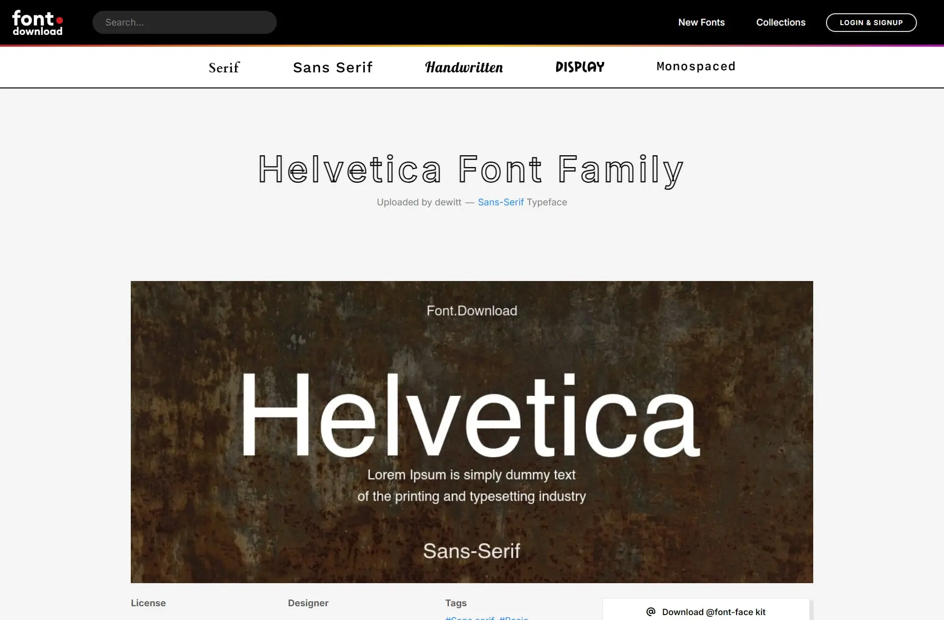
How can you maximize the use of Helvetica font when creating a website?
Helvetica, the legendary typeface, has long been a favorite in the world of graphic design. Its simplicity and flexibility make it an ideal choice for various projects, including website design.
In this article, let's take a closer look at how to maximize the use of Helvetica font to create an attractive and functional website.
Let's explore the details below!
Created by Max Miedinger and Eduard Hoffmann in Switzerland in 1957, Helvetica was initially known as "Neue Haas Grotesk". It was not until 1961 that its name was changed to "Helvetica", inspired by the Latin word "Helvetia", meaning "Switzerland".
Its geometric simplicity made it a refreshing choice in the post-World War II era, paving the way for Helvetica's worldwide popularity.
Apple is known as one of the most influential users of the Helvetica font. This typeface was not only a primary choice for Apple's advertising and promotional materials but also served as the default font on many of its devices and applications.
The use of Helvetica Neue, a modern variant within the Helvetica font family, further strengthened its popularity. In 2015, Apple made a surprising decision to move away from Helvetica as its primary font, replacing it with San Francisco.
Helvetica belongs to the neo-grotesque sans-serif font category. This means its letters are clean, streamlined, and have no decorative strokes at their ends. This simplicity makes it easy to read at various sizes and across different devices.
Its flexibility is also worth highlighting, as it can adapt to a wide range of design styles, from clean minimalism to masculine industrial-themed websites.
The benefits of using this font include high readability, a professional appearance, design flexibility, and universal compatibility.
Choosing the right Helvetica typeface and pairing it with an ideal complementary font are also important factors.
By following the tips and guidelines outlined above, we can make the most of Helvetica on our websites to achieve an optimal design that appeals to visitors.
That concludes our article on maximizing the use of Helvetica font to create an attractive website.
We hope this article is useful and provides you with new insights. If you have any constructive criticism or suggestions, feel free to leave a comment or send them through our contact us form.
Reference : Maximizing the Use of Helvetica Font to Create an Attractive Website
Read Also : 7 Best Fonts for Websites in 2025 (Modern & Professional)